Monday, August 1, 2011

Pinterest Challenge July 2011 | Project Results


The above photo was the inspiration for my project.  It originated from Addicted 2 Decorating.  I repinned someone elses pin, from a blog feature on Classy Clutter. Wow, you could totally play "seven degrees of Pinterest".  Back to the challenge...

 The week before the challenge was issued I had begun a little dining room makeover and was contemplating repainting this cabinet.


The room was getting a new coat of paint and going from Valspar City Storm to Benjamin Moore's Gray Owl.  You can see the City Storm color in the above shot and will see Gray Owl in the room in photos below.  I began to think about the turquoise piano I pinned 6 weeks ago and a lightbulb went off that I did not have to have a piano to recreate the look but could do it with my red cabinet.  I was not sure exactly what color was used on the piano so in the end I custom blended my own turquoise color. 


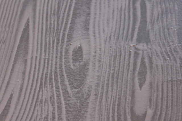
After I got the color just right, I painted the outside the teal/turquoise and the inside black.  I then worked on the back panel that I did a faux bois treatment on.  Get more detailed information about how I custom mixed the color, what colors I used and how I did the faux bois here.


While waiting for the paint to dry I began to work on the plate part.  First I laid out the plates to get an idea of what I wanted. For more detailed information about the hanging plate part, click here.


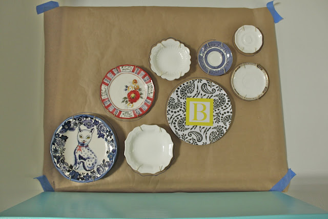
After getting the layout right, which took a few days of moving, photographing and lots of head tilting, I moved on.  I then rolled out craft paper and laid the plates down again and traced around the outside to make a pattern of sorts.


I planned to hang up the pattern above the cabinet to make sure that I liked the placement.


This is probably the third pattern I made.  I lived with it for a day taped to the wall above the cabinet before I began hanging plates.  I am so glad I did this step because they really looked different on the wall.  I used much bigger plates that the inspiration photo which is good and bad.


Next came plate hanging hooks {came with the plate hangers}.  The whole plate hanger part of this is a whole other issue/story for another time. If you want to know more about it, click here for details. Anyway, I hung the hooks and then placed the plates up.


Then it was time for the paper to come down!


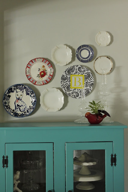
Back up the plates went!


I had been playing with different accessories for the top of the cabinet and decided to go with these CB2 vase/candle holders I have had for several years.  I also have white Zgallerie pillar candle sticks that look good that could be a future option.  I liked the lighter visual weight that the glass has since the plates are big.


Since living plants cannot survive in my home due to two furry inhabitants I just cut a few herbs and plants from the yard.


Please ignore the crazy long plate hangers!  I am going to replace/snip them down.  I really wanted to get the project done, so this had to do for the time being. For more information about the plate hangers I used, click here.


Now for a side by side comparison from the inspiration and my completed project!

There are a few changes I plan to make such as changing/modifying the plate hangers as I have already mentioned; adding or swapping plates; changing the wicker vase next to the cabinet; and maybe different knobs on the cabinet.  I love the end result!

Wednesday, July 27, 2011

Pinterest Summer Challenge!

I am so excited about this challenge!  I have the perfect idea for a dining room project obviously inspired by Pinterest.  It is probably my most loved pin.  ever.  So excited!!!

Not sure what I am talking about?  Check out YoungHouseLove, Emily Henderson, BowerPowerBlog, or Making a House a Home.

Thursday, June 30, 2011

Wedding Details {Black and White Wedding}


{all above images from ClaryPhoto see our wedding blog post here}

We just celebrated our second anniversary so I thought I would finally post some of my favorite detail shots from the wedding!  Many of the items in these photos are projects that I DIY'd such as ring bearer pillows, pinwheels, candy bar ribbons for jars, damask cardbox, and photobooth tickets.  Several of the other projects I created and had printed elsewhere were the "sugar bar" window cling, drink stir sticks, "B" cake topper, and dinner menus.

Then we had several fabulous vendors that made other items happen such as Slice of Lime Design for all of our paper goods and Exclusive Events, Inc. for our reception lighting, paper lanterns, white lounge area and decals on the columns.  I especially love our programs from Slice of Lime Design.  They are tiered and have the custom damask design flowing from one page to the next...does that sound right?  I do not know about how it sounds but it turned out fantastic! Slice of Lime Design also created our reception cards that included a poem that I wrote and probably had help from Emily from Slice of Lime Design...it's been so long I cannot even remember!  Anyway, the poem was about the candy bar, the photo booth, and the late night snack that we were serving at 10:00pm.  I will look for a photo that shows it better for another post.

A few other details were each of the bridesmaids bouquets were wrapped with a different black and white ribbon and had a vintage bow broach.  We had red balloons and paper parasols for photos, and my something blue was turquoise ribbon sewn onto the crinoline of my dress.  I also wore the antique wedding ring in the ring detail shots that belonged to my husband's grandma.  She was unable to attend so I wore the ring so she could be there in spirit.  Hmmmm.....I am trying to think of any other special details...would have probably been a good idea to have posted this 2 years ago! Oh yeah, I made my jewelry {chandelier crystal earrings and bracelet} and also made bracelets out of crystals for the bridesmaids.

Not sure if I have previously posted this, but here was our vendor line up for the day!
Photography: ClaryPhoto-Clary Pfeiffer Photography {blog}
Videography: Archway Media (I still have not selected my music so no video yet...)
Paper Goods: Slice of Lime Design
Florist: RW Designs
Wedding Coordinator: Proposing Dreams
Ceremony: St. Ambrose on the hill
Reception: Windows On Washington {8th floor}
Lighting and Decor: Exclusive Events, Inc.
Extras: Photobooth Stl 
Cake: The Cakery 
Rehearsal Dinner: Spink Pavillion Missouri Botanical Gardens
Transportation: A Perfect Touch
Make-up: Holly Speakes
Wedding Dress: Priscilla of Boston Vineyard Collection, Town and Country Bridal

I think that is it!

Tuesday, February 1, 2011

Cute and Stylish Camera Bag Part 4?

Thanks to an anonymous comment on my last post about camera bags I decided to wait and check out what the new Epiphanie Bags had to offer. I was definitely excited that they would be offering a bag that could hold a laptop.  What a great way to kill two birds with one stone! 


Love the new color options for the originals and the new styles.  Of the new styles, I like Clover best.  But I am still in love with Lola.  I am not sure if it is just the red or the style.  I am definitely more of a pink fan, but again, there is just something about the red bag.  

So I am still leaning towards Lola in red, but they are back ordered until April.  Maybe I should go ahead and order...
Related Posts with Thumbnails